
There’s a stereotype about journalists that I’ve always resented: “Journalists can’t do math.” It was one of the first things my Intro to Journalism professor told my class when I started college. She tried to get us to break this stereotype by assigning us a daily math quiz. Often — and sadly — our math questions came from published news stories that had gotten the math wrong or misworded their presentation of data or numbers.
It’s been 15 years since I took that class, and we now live in a world where many of the articles we read are based on numbers. We’re constantly talking about polls, budgets and “the data.” At the same time, it’s become much easier for anyone to gather data. The problem is, we don’t always report results correctly or comprehensively.
To help everyone, from journalists to readers, get a better understanding of how to use numbers and parse the data you’re presented, I sat down with Alliance research director, Rebecca Frank, to discuss what it is we all need to remember when reporting data — whether by scientific researchers, or our own
Interpreting Data
The first question you need to ask yourself about any data is why the information was sought in the first place. What was the big question behind the research? As much as we’d like to believe polls and surveys are conducted purely out of curiosity, people generally go into it with a prediction of the outcome, or hypothesis. And as Frank notes, “If you’re the one asking the question, you have to be prepared for the truth to be different than what you think.”
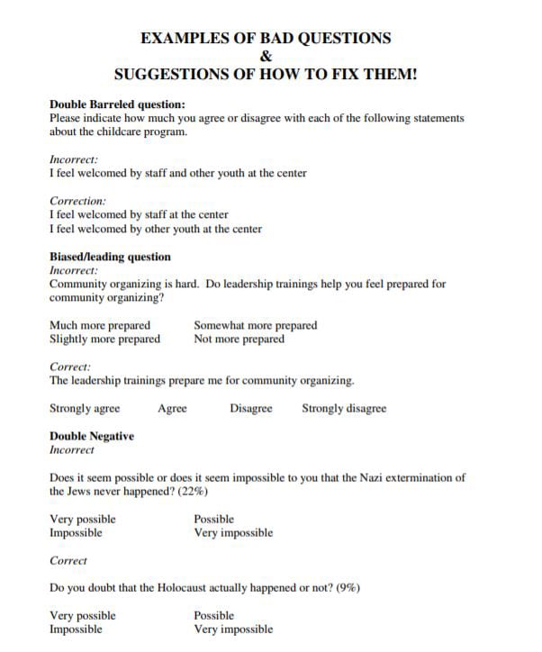
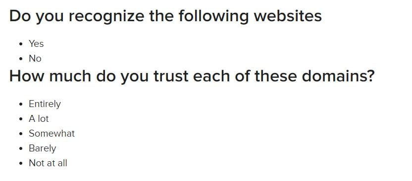
What you think will color how you present or perceive the results. When gathering data, you need to consider how you’re asking the questions and who you’re asking to respond. “There’s an art to writing surveys and interpreting the data,” Frank admits.
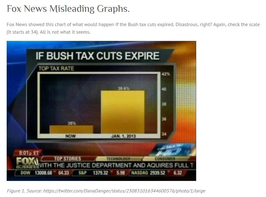
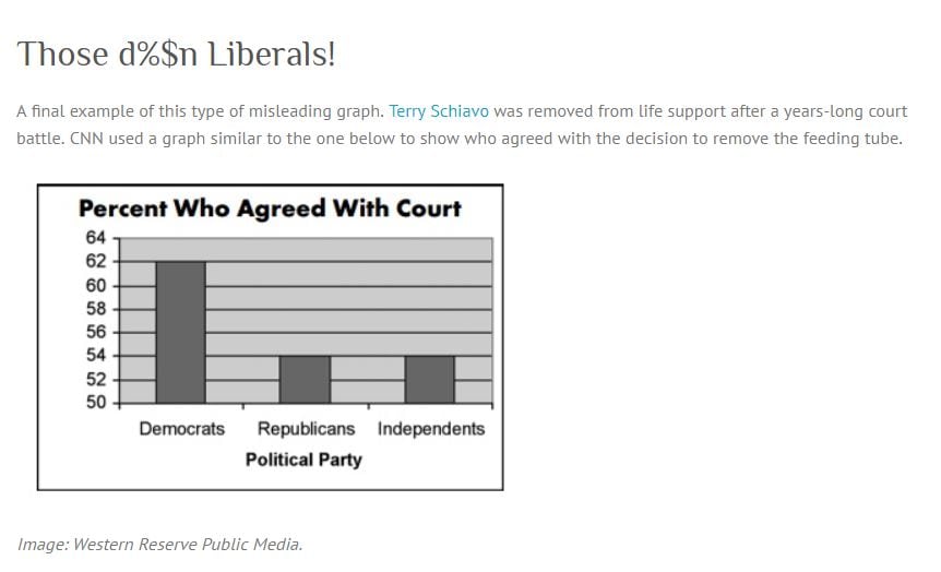
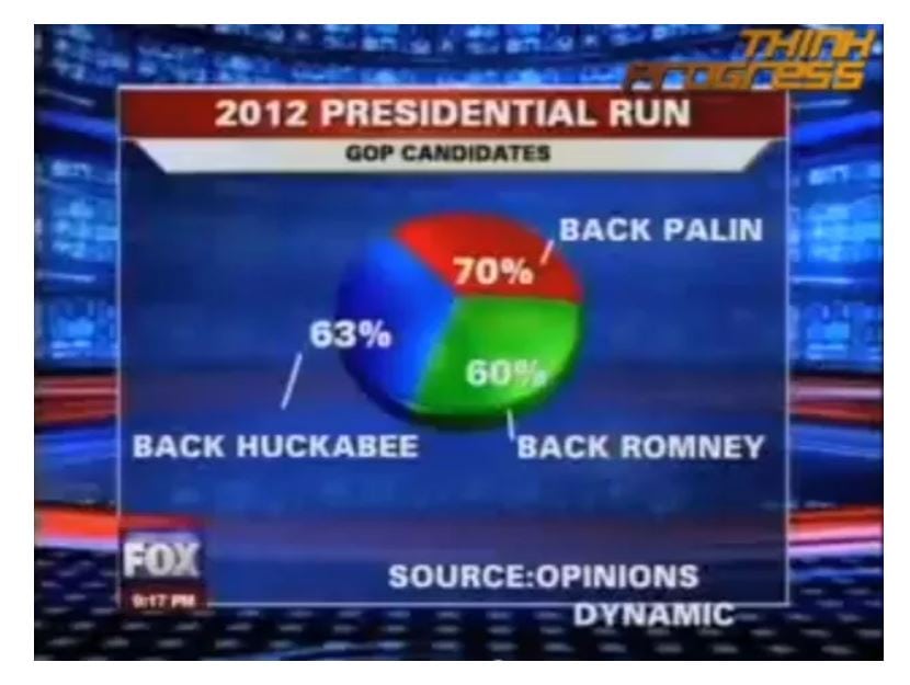
A key to keeping trust is making the methodology public, Frank says. That’s a good sign of reputability. Another clue to knowing if numbers are reputable is if the visual presentation of the data is properly labeled. It may sound simple, but Frank points out that you need to “be wary of graphs without stated values” because they can easily manipulate your perception of the numbers. It’s also important to note what the stated numbers are. As you’ll see in the examples below, clear labeling doesn’t always solve the problem.
Gathering Data
“All data is subject to the same quirks and misinterpretations as other information,” Frank says. “But good journalists will do their research.”
One source of concern: How did you collect your data? While technology has given us a plethora of polling options, not all are created equal. There are perks and pitfalls to each method. The type of survey you use will depend on who you’re hoping to reach and how wide a range of views you’re hoping to encounter.
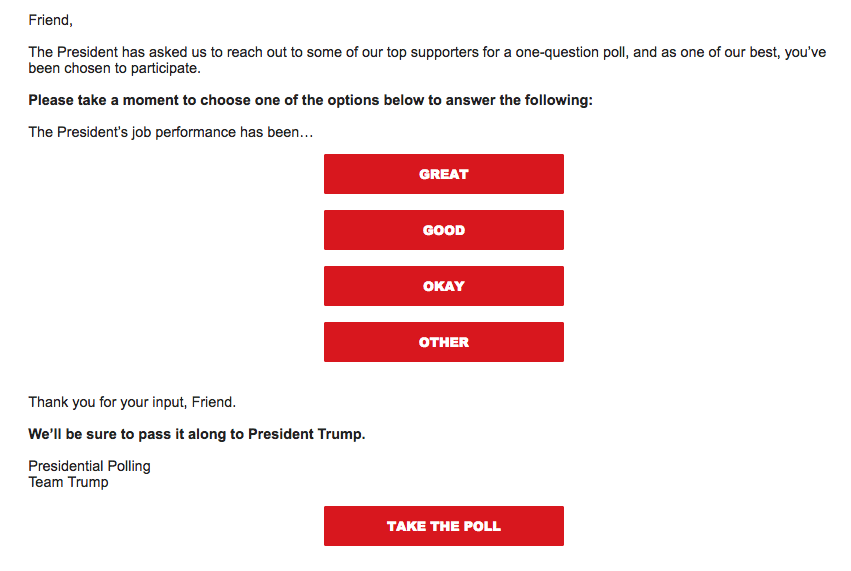
If you do a Twitter poll, for example, it’s very easy to ask a single question and get immediate responses. However, “your poll is only as varied as your audience,” Frank explains, so you likely won’t get data you can use to tell a bigger story. That’s because a Fox News Twitter poll can ask the same question as one from MSNBC and get completely different results based on their audience. And because Twitter provides no way of collecting data on who is responding, it is impossible to interpret the data in any nuanced fashion.
The same is true for polls conducted on Facebook or Instagram. So, while these polls are great for adding color to stories or engaging readers, they are not done using established scientific processes and don’t present truly usable numbers.
Other survey tools include such user-friendly options as SurveyMonkey and Constant Contact, for casual yet customizable polling.
But for the most credible survey results, hiring a research firm like Morning Consult is the best approach. These firms have pools of subjects from all demographics (age, race, gender, income and education level, married or unmarried, children living at home, etc.) and geographic regions that respond to their surveys, ensuring statistically significant results (i.e. the results were not reached by chance or due to an outside factor). You can also hire a professional research firm to conduct in-person focus groups to get more qualitative insights and dig deeper into an issue with a specific demographic group.
Reporting Data
Once you’ve got all the numbers in, you have to consider how you’ll present them. Will you be rounding to the nearest percentage point? Rounding is a big issue in data, Frank explains, and it has the potential to change the numbers significantly. (There’s a great look at the whys and hows of rounding from the UK Parliament that you can find here.)
In addition, you need to think about things like margin of error and statistical significance. “Mathematically significant is not necessarily significant in real life,” Frank explains. That said, if you’re going to say that your data is significant, you should be able to back it up. That might mean noting the margin of error (or the accuracy of your findings when compared to the greater population) or citing other surveys that support your findings.
Sample size is also important in being able to say if the survey findings are representative of the larger population. For example, if a survey is looking for data on the US adult population, the research firm will recruit enough respondents from various demographics and geographic regions to create a representative sample, using the US Census, which ensures they can apply the results to all adult Americans.
You also need to look at what question was originally asked, which can influence the results. If the question says one thing but the research write-up says something else, there’s a disconnect there that will cause readers to be misled about what the data really say.
Next, you need to think about the story you’re going to tell.
What’s most important in sharing and viewing data is that you’re not taking the numbers at face value. You should report the results in the context of the larger body of research. Not to do so, especially if your story is reporting data that significantly departs from the consensus on the issue to date, is misleading the reader. Don’t assume the reader knows anything more than what they are reading in your article, or that they will dig further – they likely won’t. In this age of click-bait and sharing only headlines without the rest of the story on social media, we need to do our part to educate readers and give them rich information that allows them to navigate life as informed citizens.
It may take a little more work to see beyond the bold-faced numbers, but as both a journalist and a reader, you’ll be doing yourself a favor if you’re willing to dig deeper and really get to know what those numbers truly say.
If you’ve got examples of bad data reporting — or, better yet, great data reporting — you can share it with us by emailing jennifer@newsmediaalliance.org or tweeting @EditrixJen. We’d also love to know what else you’d like to learn in 2018, whether you’re on the business or creative side of the news media business. Please reach out and let us know what you want to know!